Seven Recent projects
This is a collection of illustrations I have made over recent months.
Hello again and thanks stopping by!
Here are some illustrations i've made over recent months.
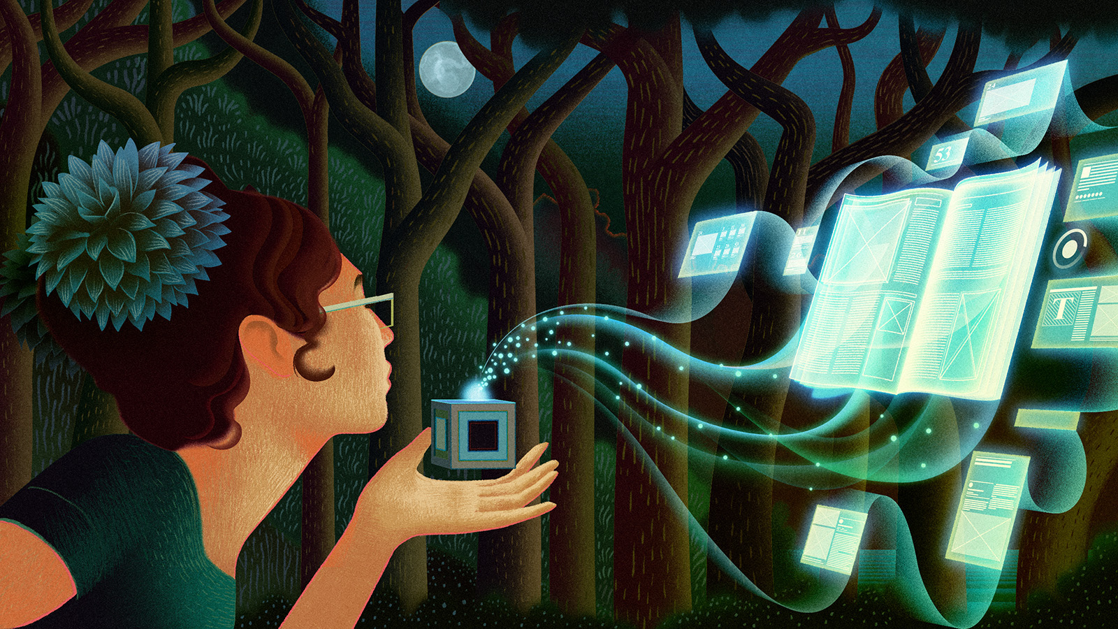
First up is an image I created for Adobe.
This is a hero* image for an online tutorial covering the new colour picker tool for InDesign CC.
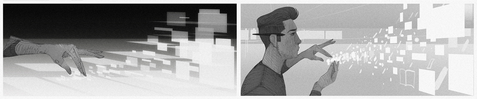
Here's some of the intial sketches. One of the early ideas was to have the cat's face appearing on a 3D swatch, but we moved past this fairly swiftly...
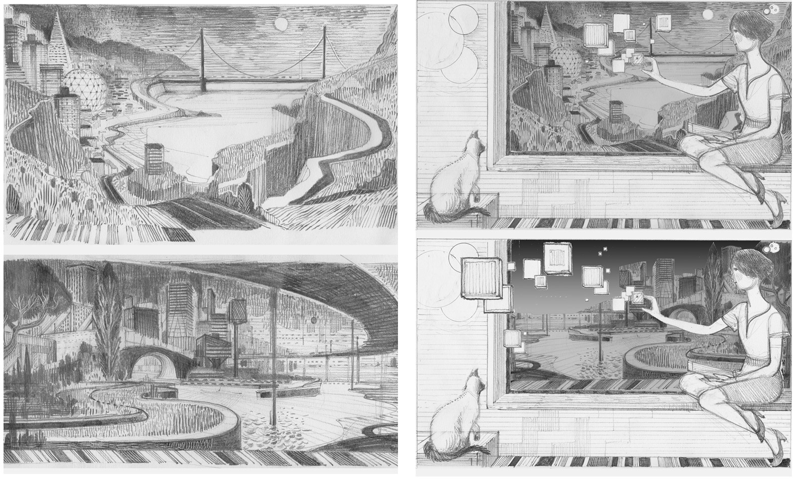
Here are a few of the alternate ideas. This main image being used within the tutorial depicted the Golden Gate Bridge so it was important to echo this in the illustration. The figure on the right is a slight homage to a painting I like called The Fortune Teller by Julio Romero de Torres**
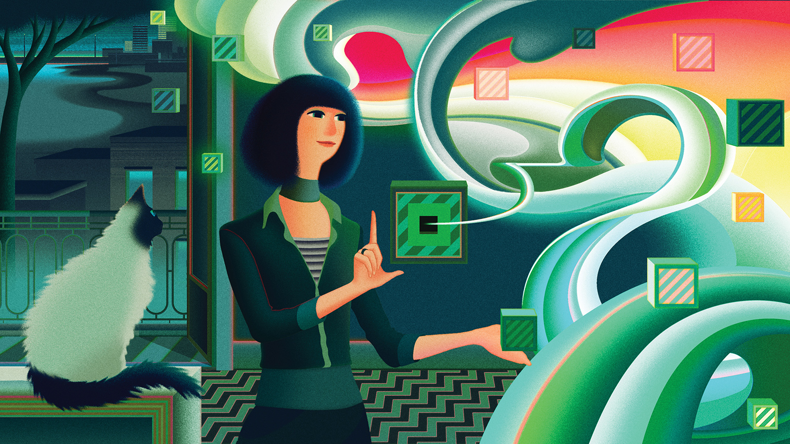
Here's another illustration for Adobe! And once again concerning InDesign CC.
This is heading up a short video introduction to InDesign CC and the new features it offers. The content featured within the video is has an outdoor theme so I was keen to reflect that in the image. I wanted to create something elemental like starting fire with a spark as an analogy for initiating the creative process and this is what I came up with.
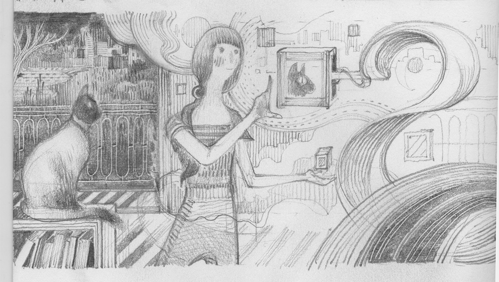
Here are some of the alternative ideas. my main aim here was to avoid depicting somebody at a computer (in the traditional sense anyway)
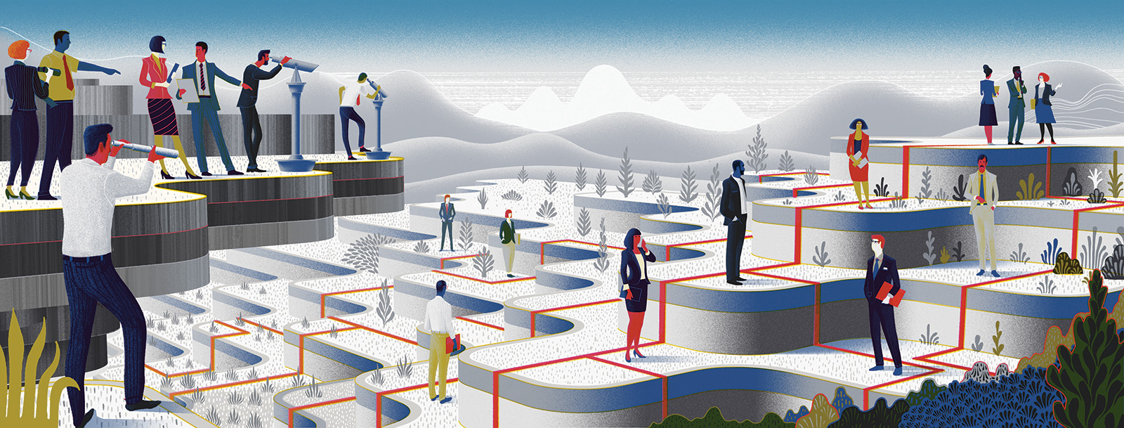
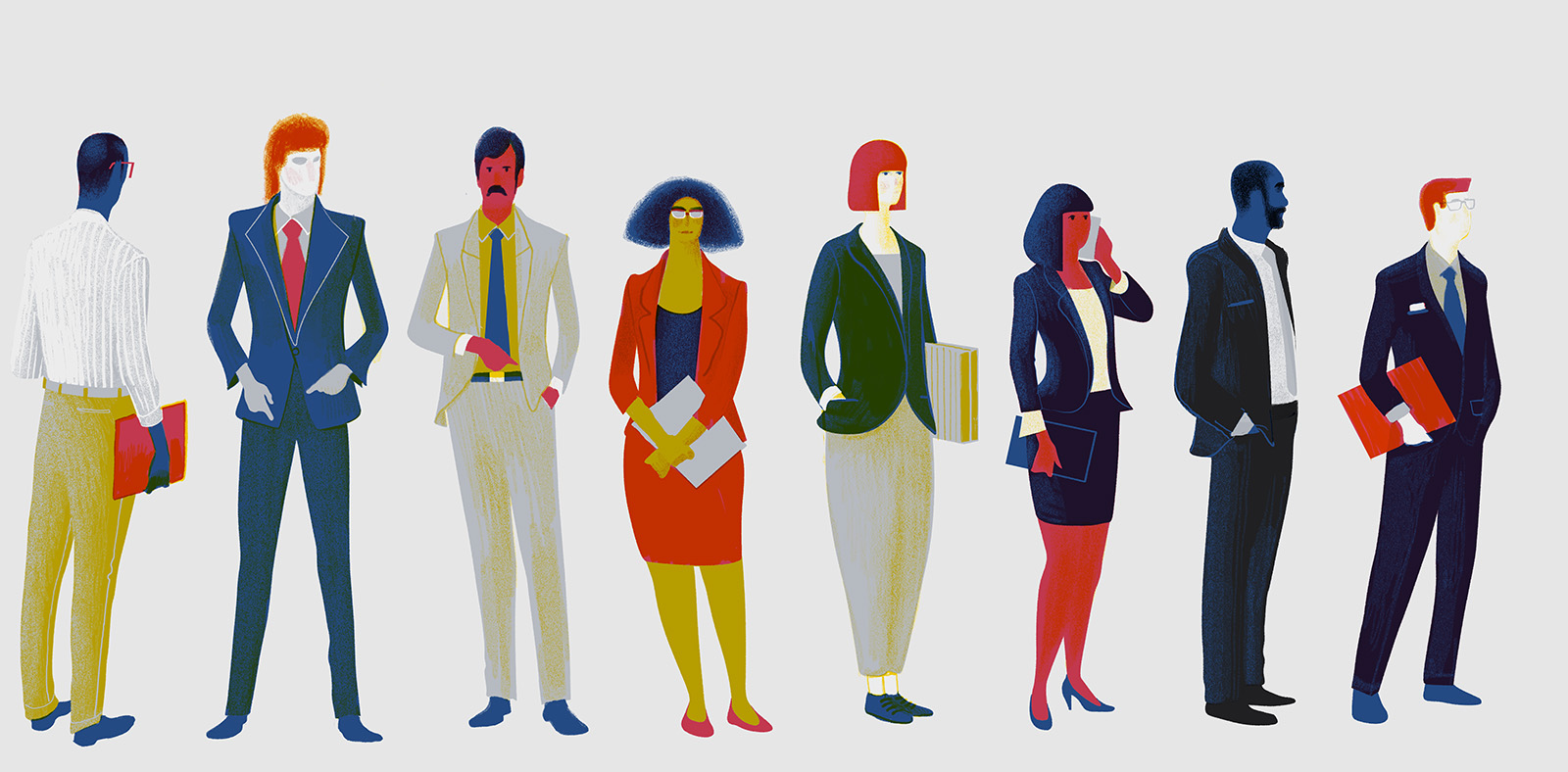
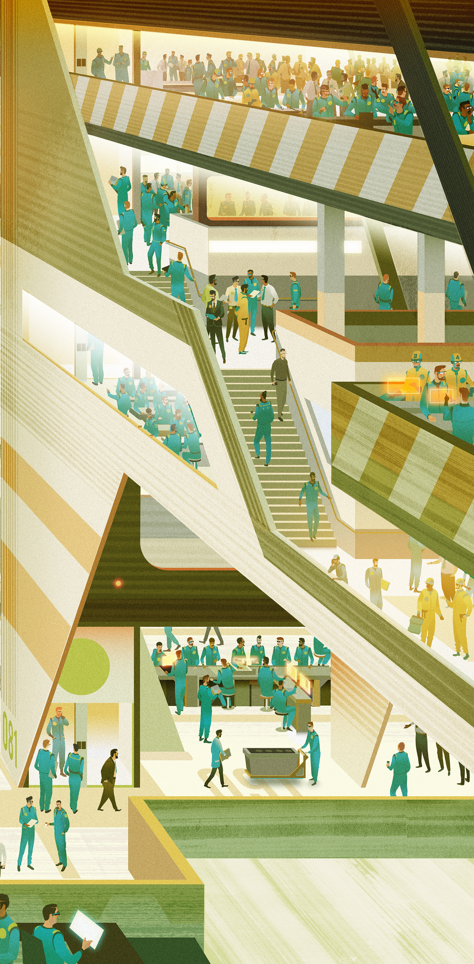
This is an Illustration for a magazine called Economia. The subject is about something called Succession Planning.
Apparently succession planning is when the board members of a company attempt to identify individuals who they think might be able to lead the company in coming years according to any given strategy. For this I wanted to expand on the idea of a 3D chess board type of thing... with the overlording board members over seeing everything.
I started work on this the day i learned of David Bowie's passing, so i decided to listen to his entire back catalogue in reverse order (even his late 90's dalliance with Drum & Bass)
hence his inclusion here. Completely misplaced in this image of course as there'll be no one succeeding him. Unless we clone him but that would be so wrong... right?
Here's one of the rough drawings. This is actually a drawing over the top of a 3D render, it's just quicker that way sometimes...
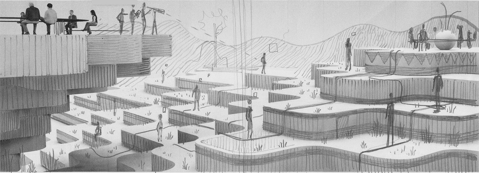
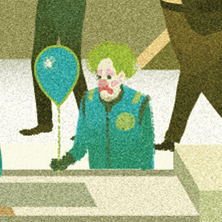
And now... This!
Can you spot the Clown?***
It is definitely better viewed up close.
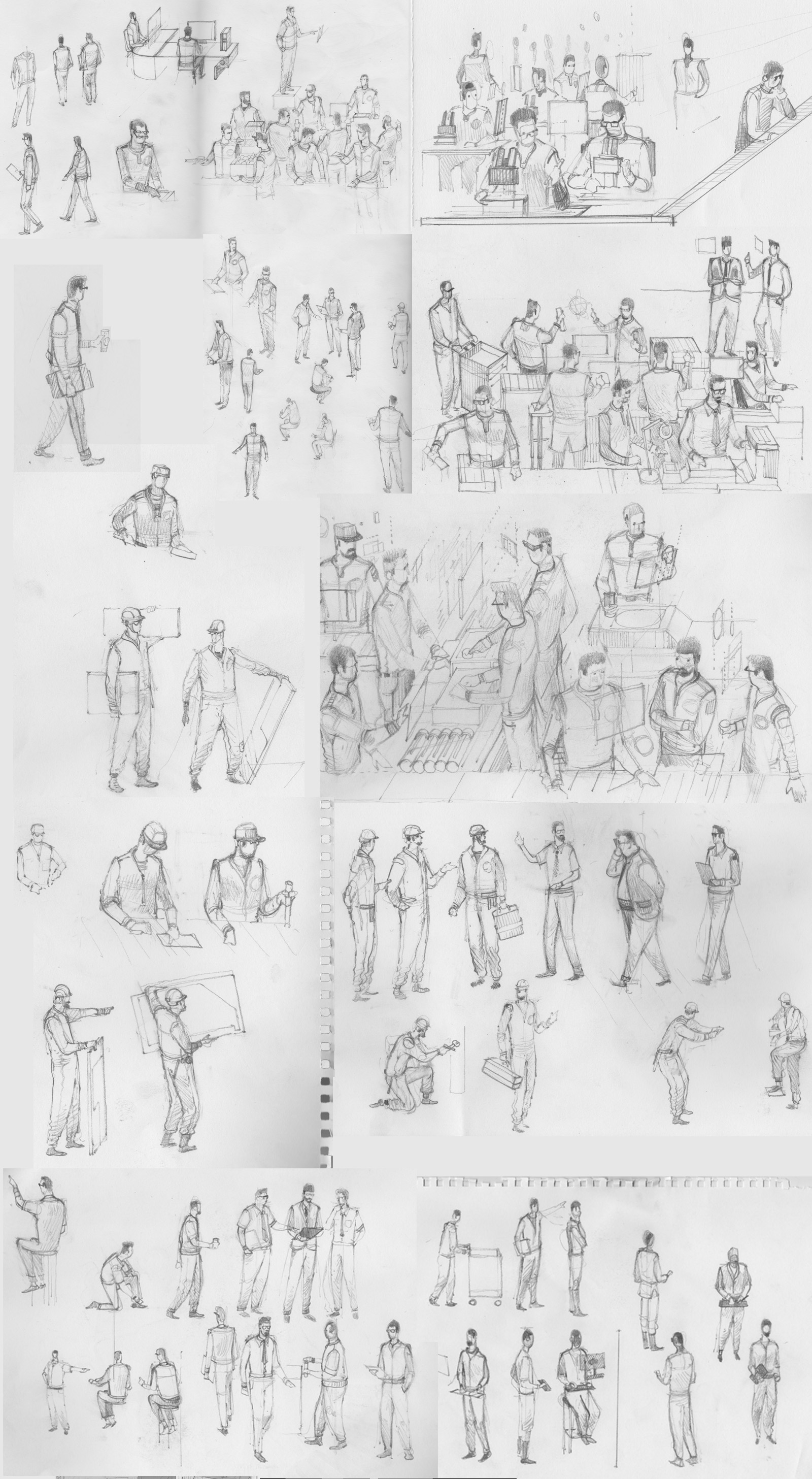
Here's some of the drawings.
Anyway that's quite enough of that...
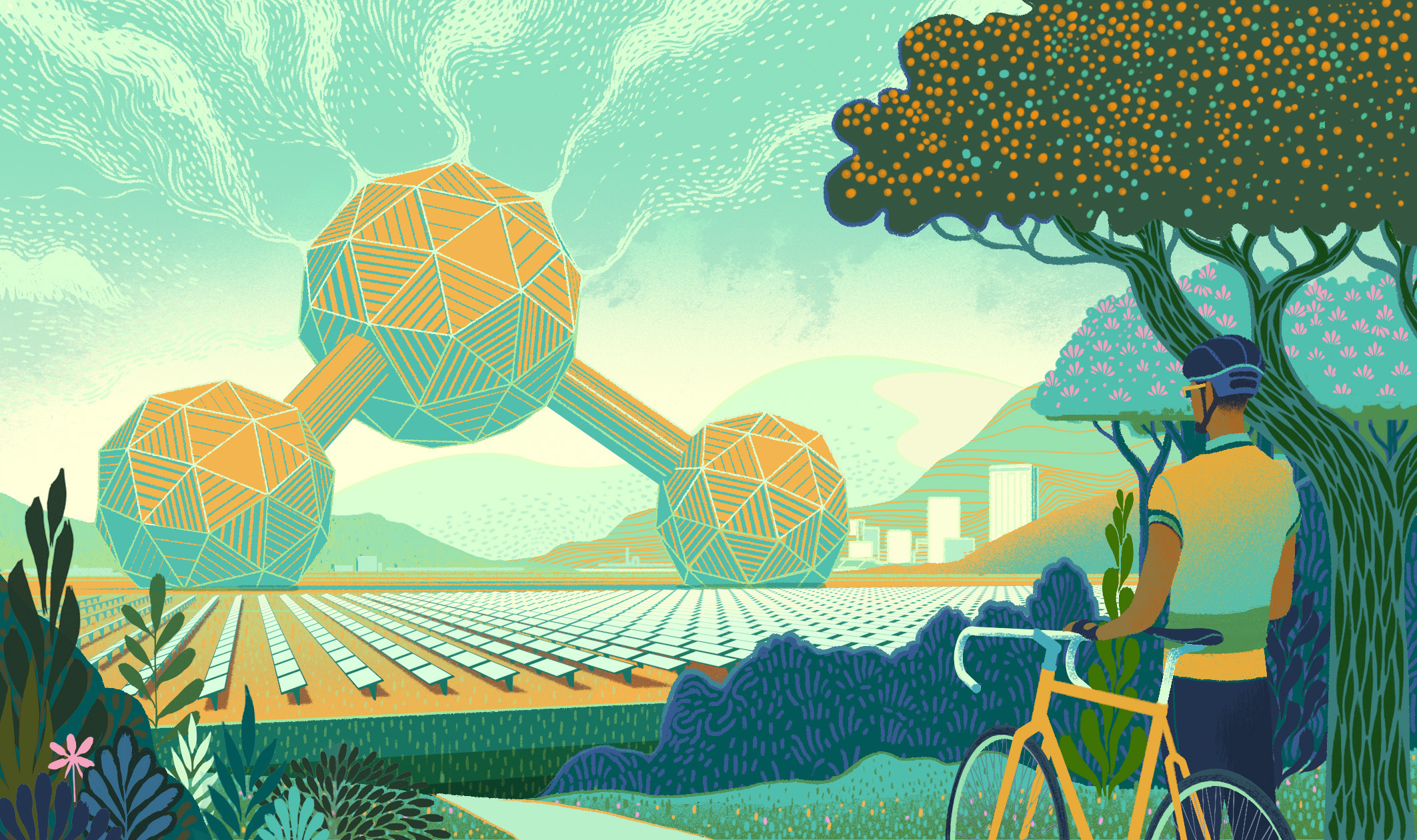
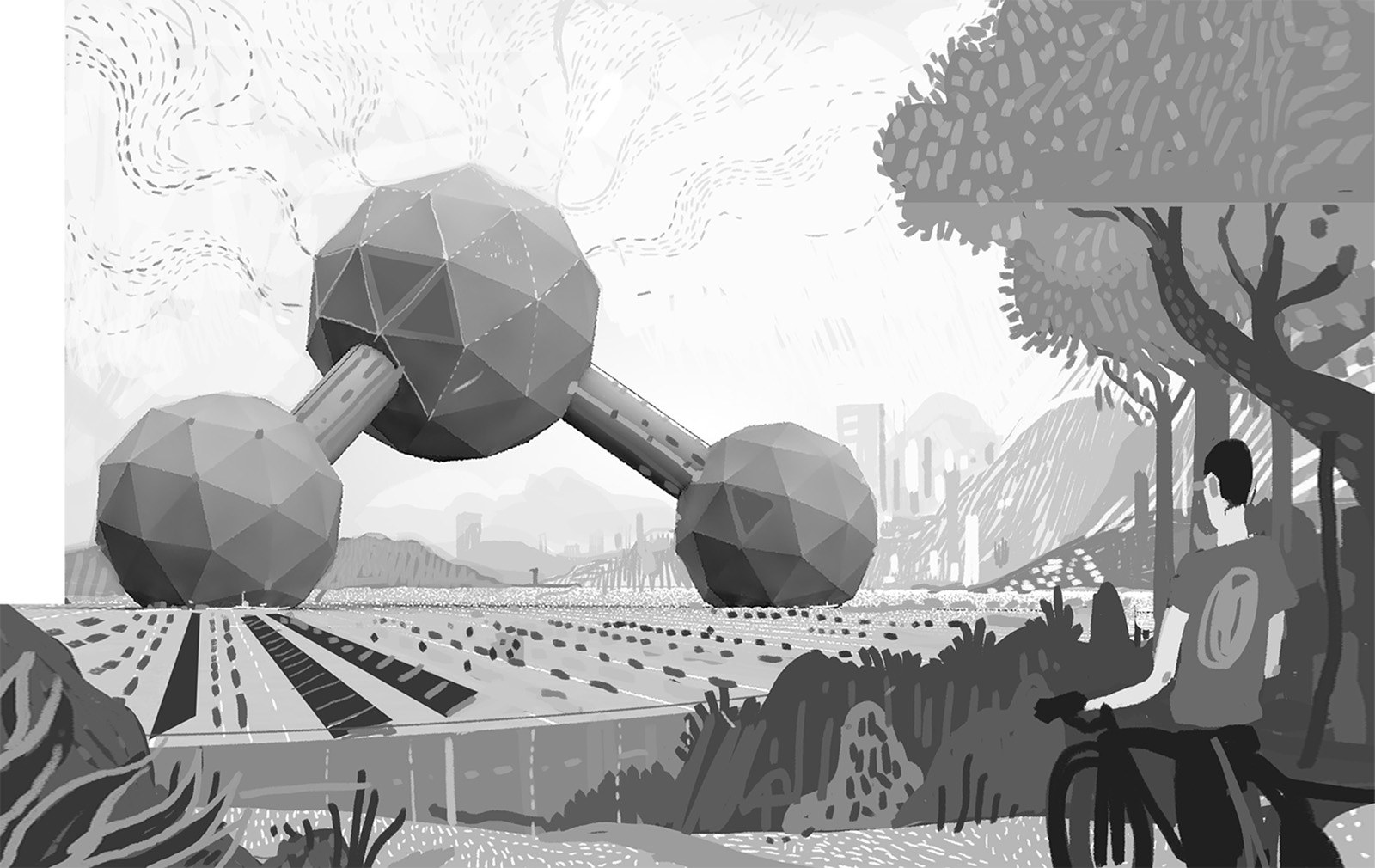
This next Illustration was made for the lovely people over at U of T Magazine.
It's about how in the future it could be possible to capture carbon dioxide from the air and convert it into fuel.
What better reason to depict a huge solar powered Carbon molecule shaped structure sucking carbon dioxide out of the air?
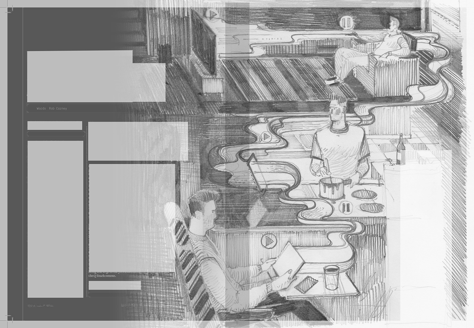
Is it possible to make an illustration of somebody watching TV in 3 different locations interesting? That was one of the challenges I faced when I was briefed by T3 magazine for an article that was in effect a review of Sky Q. The other challange was to depict this in a linear way that made sense navigating by all the words and guttering on the spread. The answer for me was to use wibbly shapes, as it often always is.

Here's one of the working drawings showing all the obstacles...
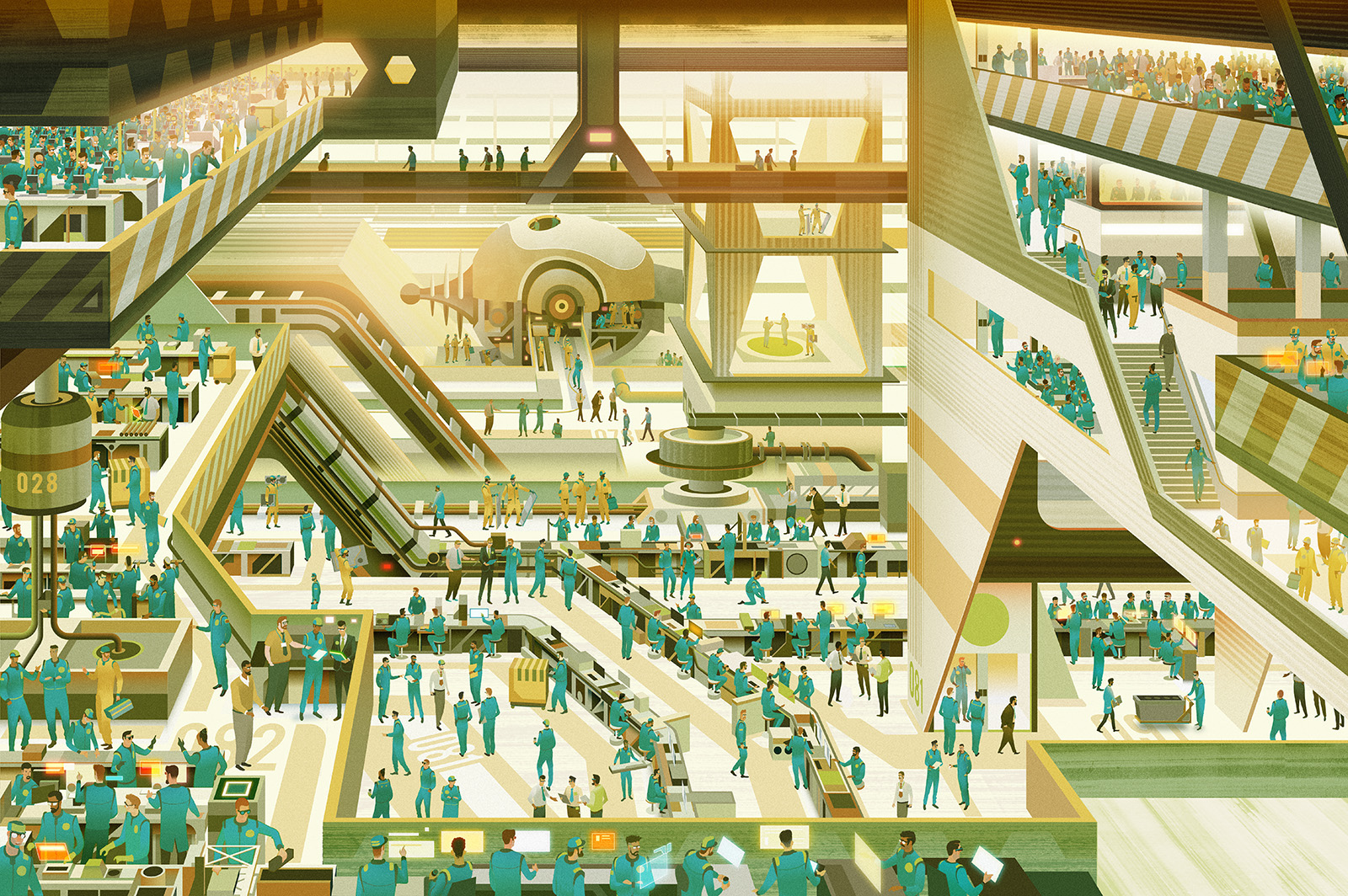
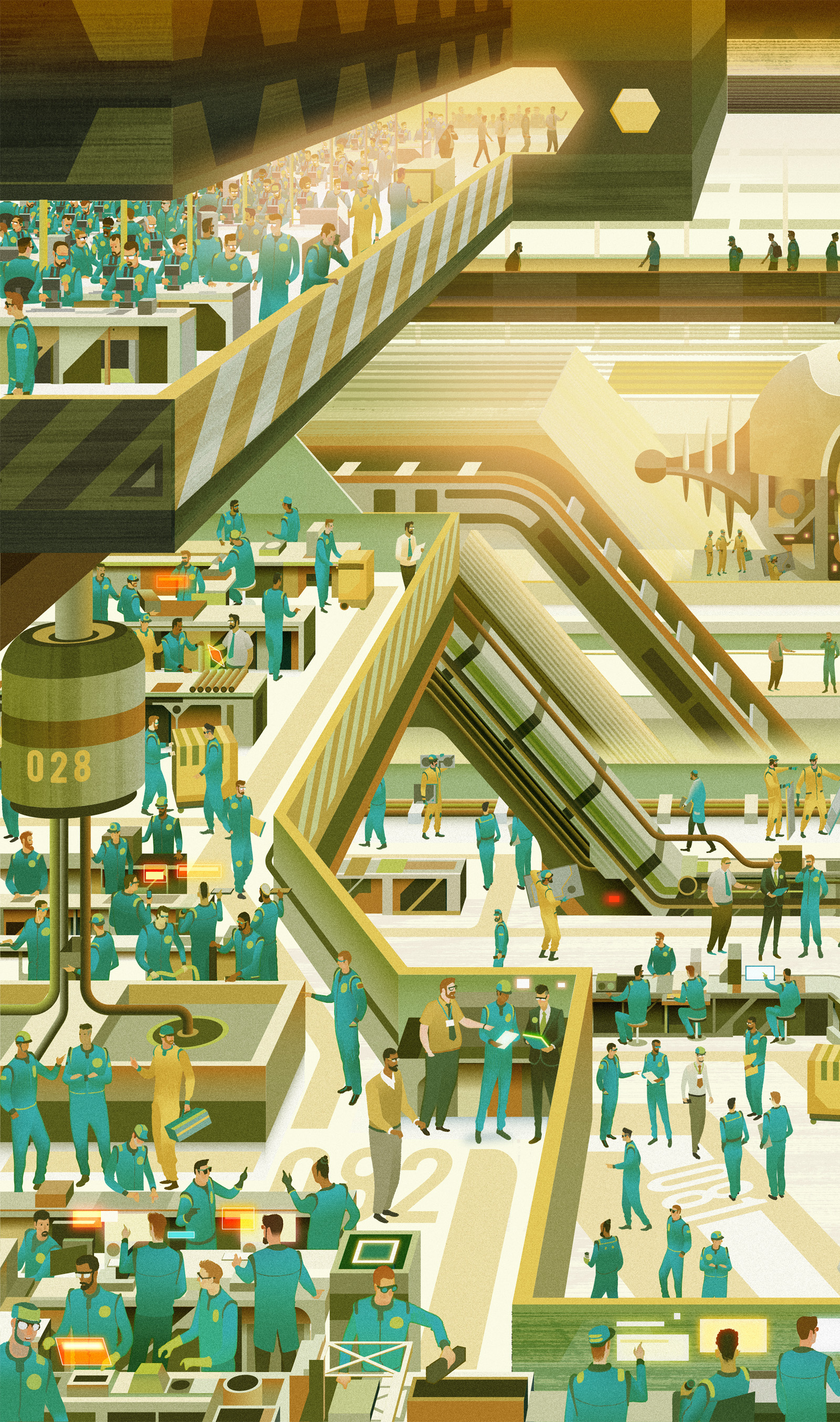
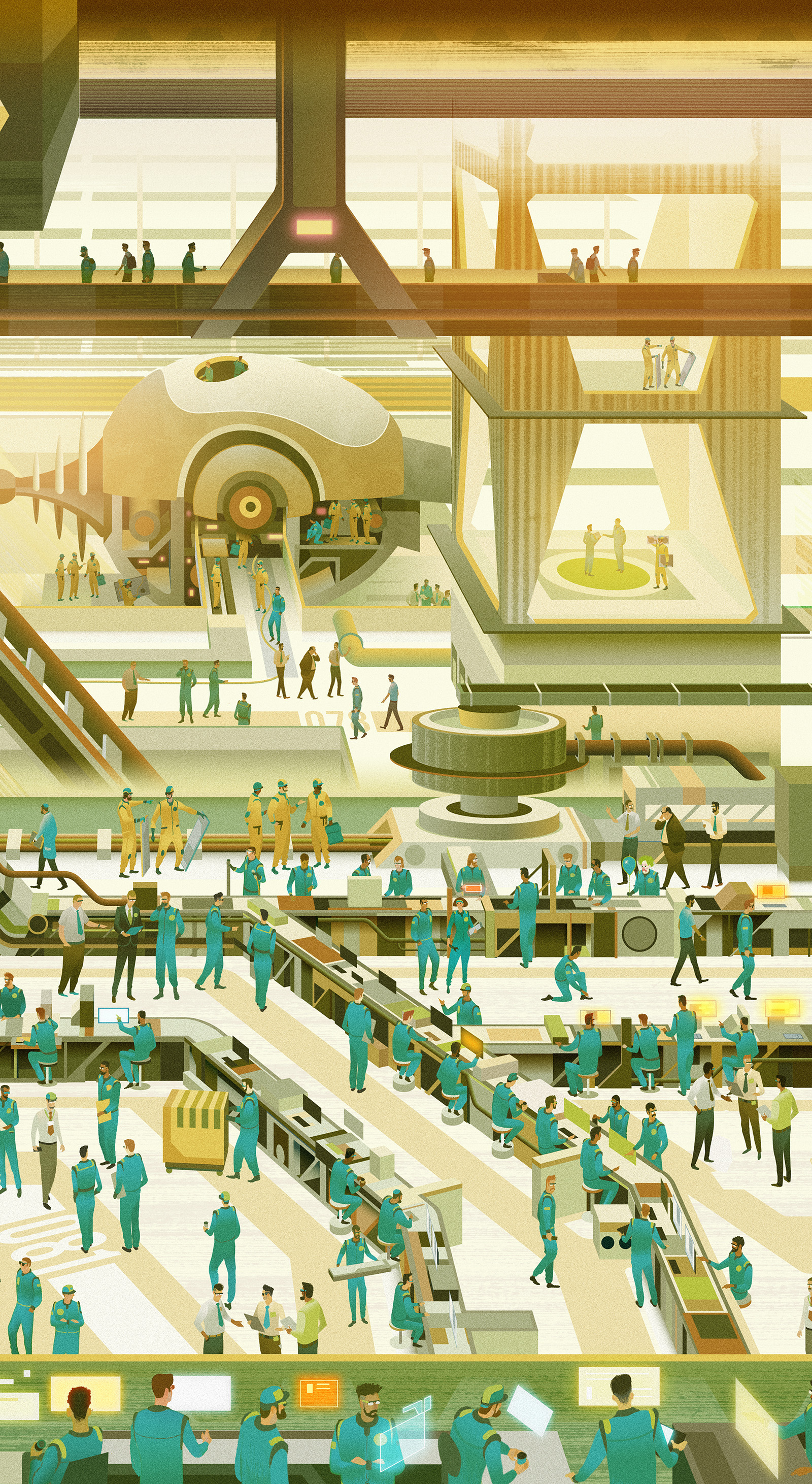
And lastly but not leastly, here's an image I made for Mojo's lead review of The Coral's new album Distance Inbetween.
Stylistically this is a slight oddity to be included here but it was very enjoyable to work on.

So this is the end of my little round up. Thanks for getting this far and thanks again for checking out my work
*' 'Hero' image was a new thing to me - at first I thought they literally wanted an image of a Super Hero, it seemed odd as super heroes aren't really my thing. But no it seems to be a new term that obviously means 'flagship image' or cover image...
** Google Cultural Institute is an amzing resource, I always go here for inspiration.
*** If you didn't spot the clown - look down